2022
Alupressing
Alupressing.cz
Background
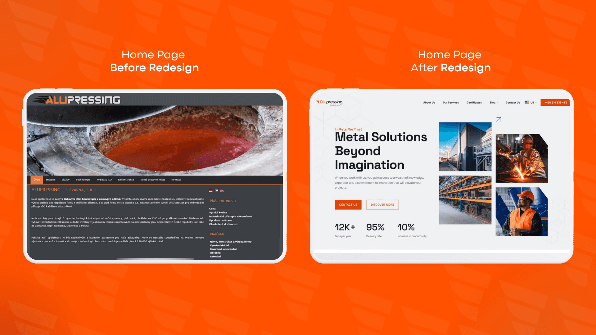
Alupressing, one of Europe’s largest metal foundries, supplies high-quality metals across major industrial hubs including the Czech Republic, Germany, Slovakia, Poland, and Croatia. Despite its market leadership, Alupressing’s brand identity and online presence lagged behind its stature. Their outdated website, originally built by the company owner, failed to reflect the professionalism and industrial expertise expected by clients in a competitive B2B environment.
Core problem
The legacy website’s early-2000s design aesthetic undermined Alupressing’s credibility and made potential clients question the company’s seriousness and technical sophistication. With a cluttered, amateur look, the site lacked intuitive navigation and a cohesive brand voice, limiting its ability to attract and convert high-value industrial partners.
Content
Approach & Process
Research and Discovery
We began by auditing the existing brand touchpoints and gathering feedback from key stakeholders and clients across Alupressing’s core markets. This revealed a strong desire to modernize the company’s image without losing its industrial heritage or authority.
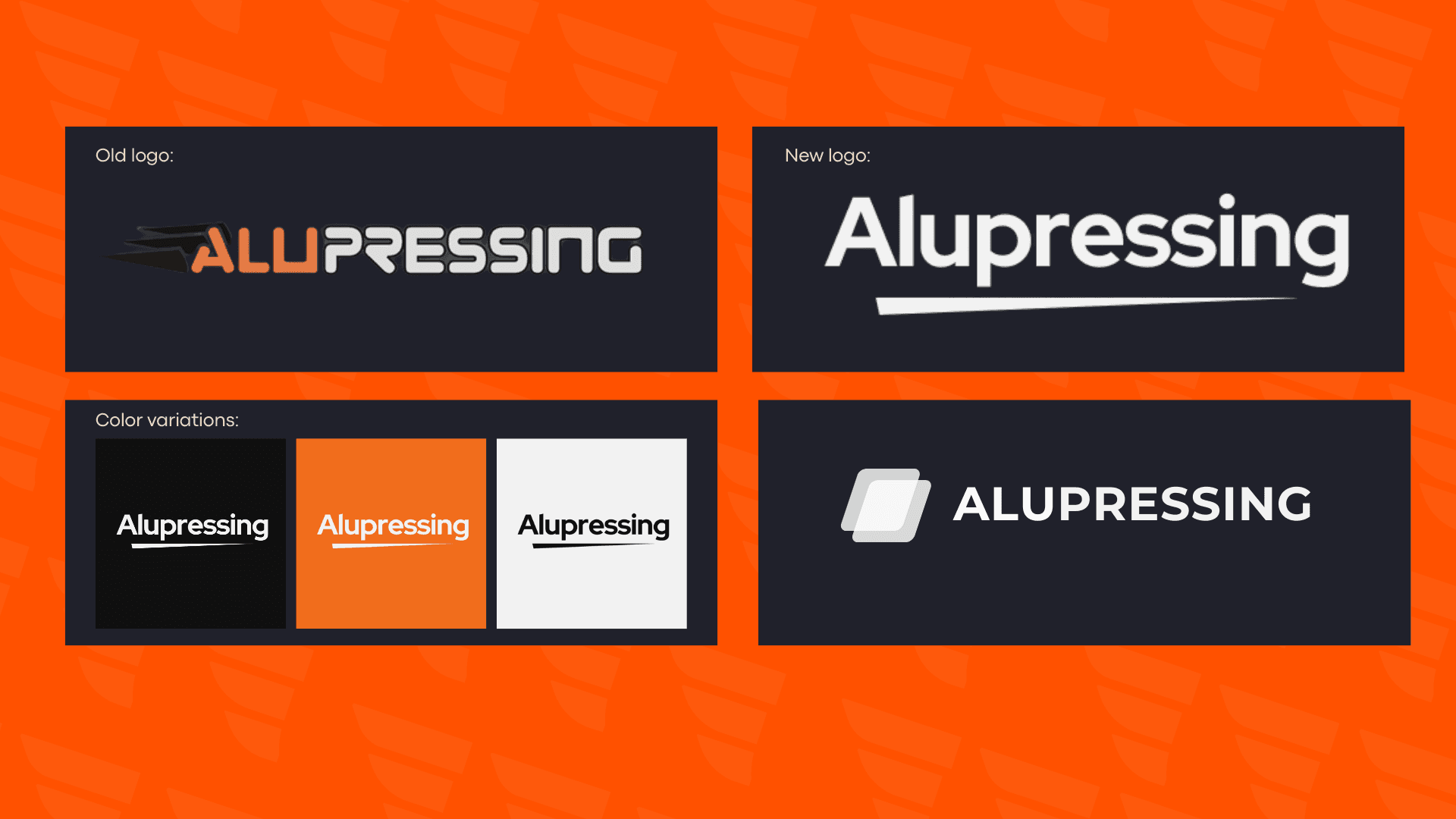
Brand Identity Redesign
I developed a refreshed brand identity centered around the concept of molten metal—capturing the intensity and precision of Alupressing’s foundry processes. The new logo combined strong, geometric shapes with dynamic elements that suggested heat and transformation, conveying both reliability and innovation.
Website Design & Development
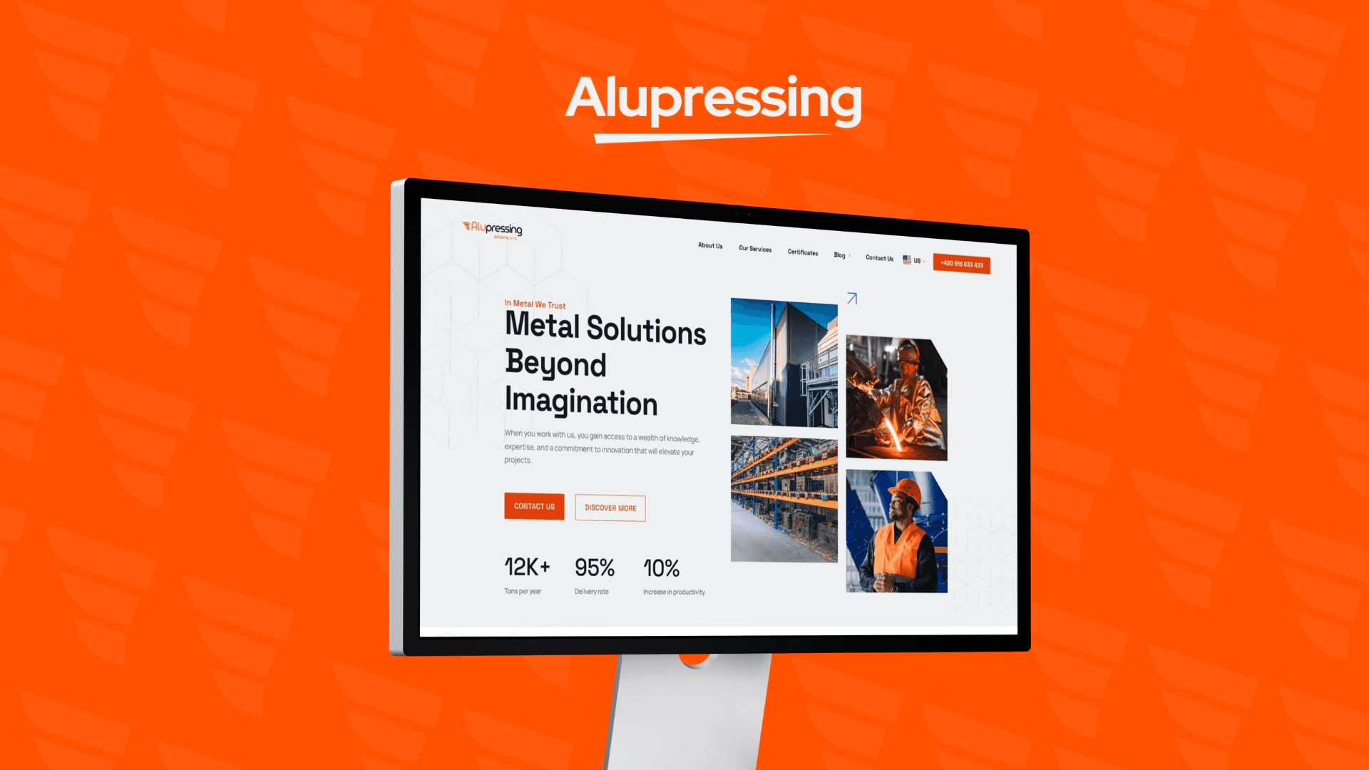
Modern Visual Language: Leveraging a vibrant orange color palette inspired by molten lava, the site visually communicated the heat and energy integral to metal production.
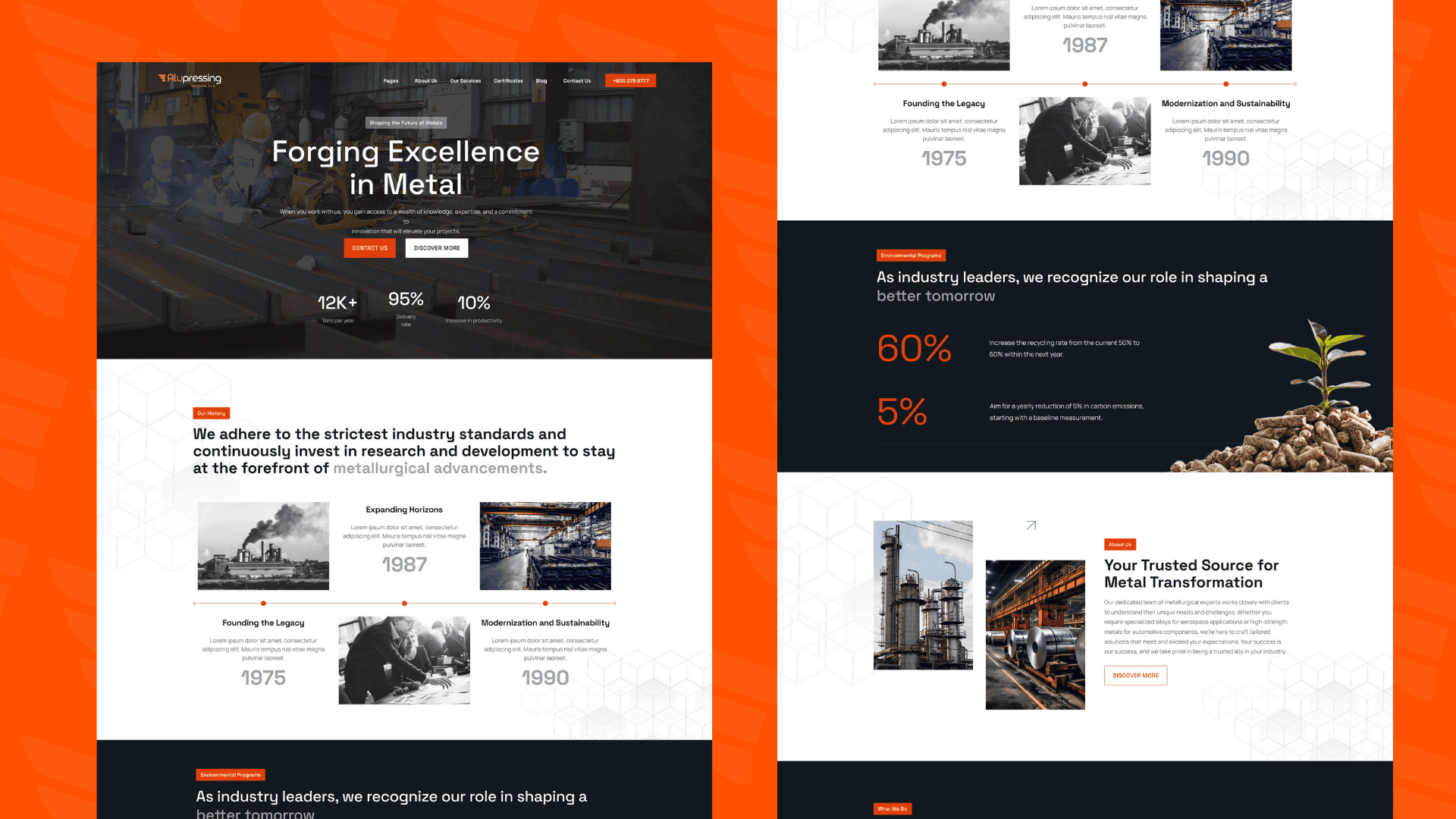
Streamlined User Experience: Navigation was rebuilt to prioritize quick access to product specifications, certifications, and case studies, essential for technical buyers.
Professional, Industrial Aesthetic: Clean layouts, custom iconography, and high-impact imagery reinforced the brand’s authoritative presence.
Responsive and Accessible: Ensuring seamless performance across devices broadened the site’s reach to international clients on desktop and mobile.
Key Features
Brand new, bold logo reflecting industrial heat and precision
Bright, lava-inspired color scheme that stands out in the metal industry
Clear, user-friendly navigation designed for B2B buyers
Consistent branding across all digital assets
Mobile-optimized for global client accessibility
Business Outcome
The complete brand and website overhaul elevated Alupressing’s market perception from “outdated” to “industry leader.” Within three months of launch, the website saw a 40% increase in user engagement and a 25% boost in direct inquiries from key European markets. Feedback from partners highlighted the newfound professionalism and clarity, directly contributing to stronger client relationships and new contracts. This project showcased my ability to translate complex industrial processes into compelling, modern digital experiences — positioning me as a senior design leader ready to elevate top-tier tech brands.
